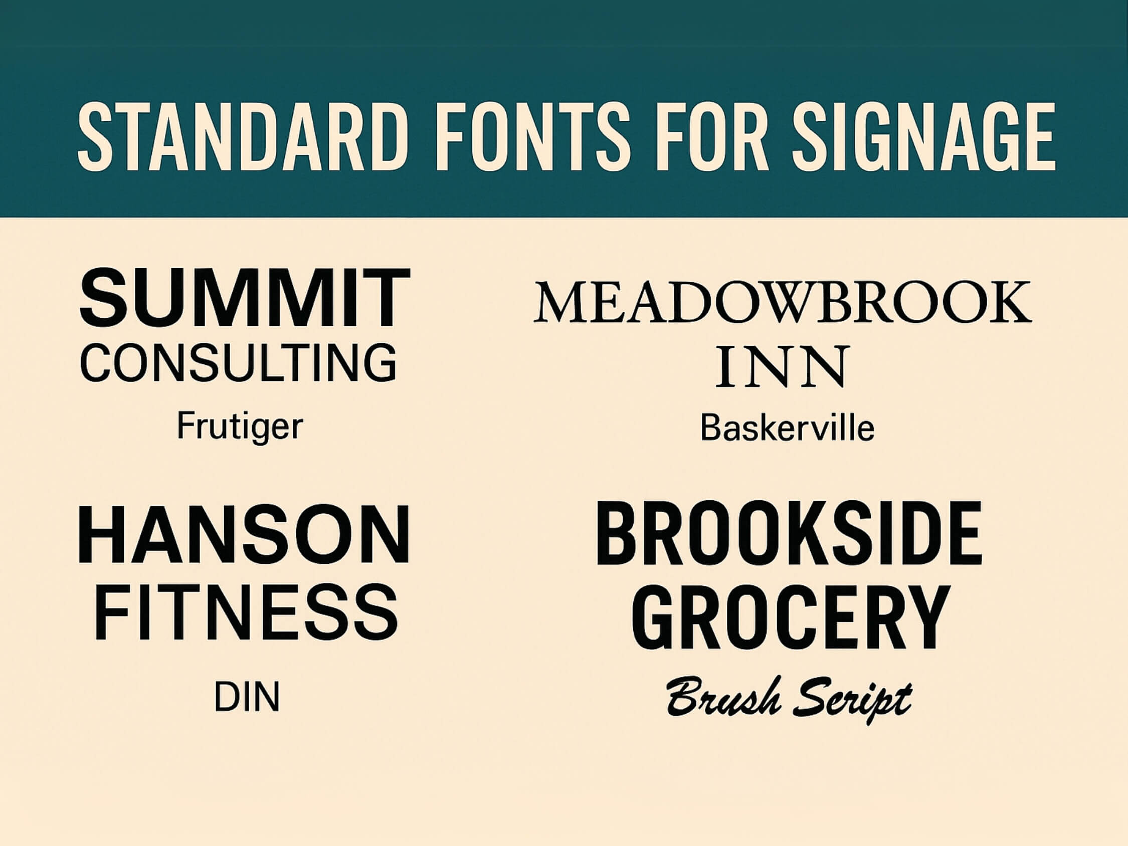
Standard Fonts for Signage
At Signs NYC, we understand that the right typography is essential for effective signage. Choosing the proper font not only ensures readability from a distance but also reinforces your brand identity. To help streamline your design process and ensure consistency across all your signage, we’ve outlined our standard font recommendations for optimal results.
Why Font Choice Matters
The fonts you use on your signs can significantly impact how your message is received. Whether you’re creating outdoor billboards or indoor wayfinding signs, the right font improves legibility and ensures your brand stands out in the best possible way.
-
Readability:
Choose fonts that are legible from varying distances and in different lighting conditions. -
Consistency:
Using standardized fonts across your signage creates a cohesive and professional brand image. -
Professionalism:
Proper font selection enhances the overall design quality and effectiveness of your signage.
Our Recommended Fonts
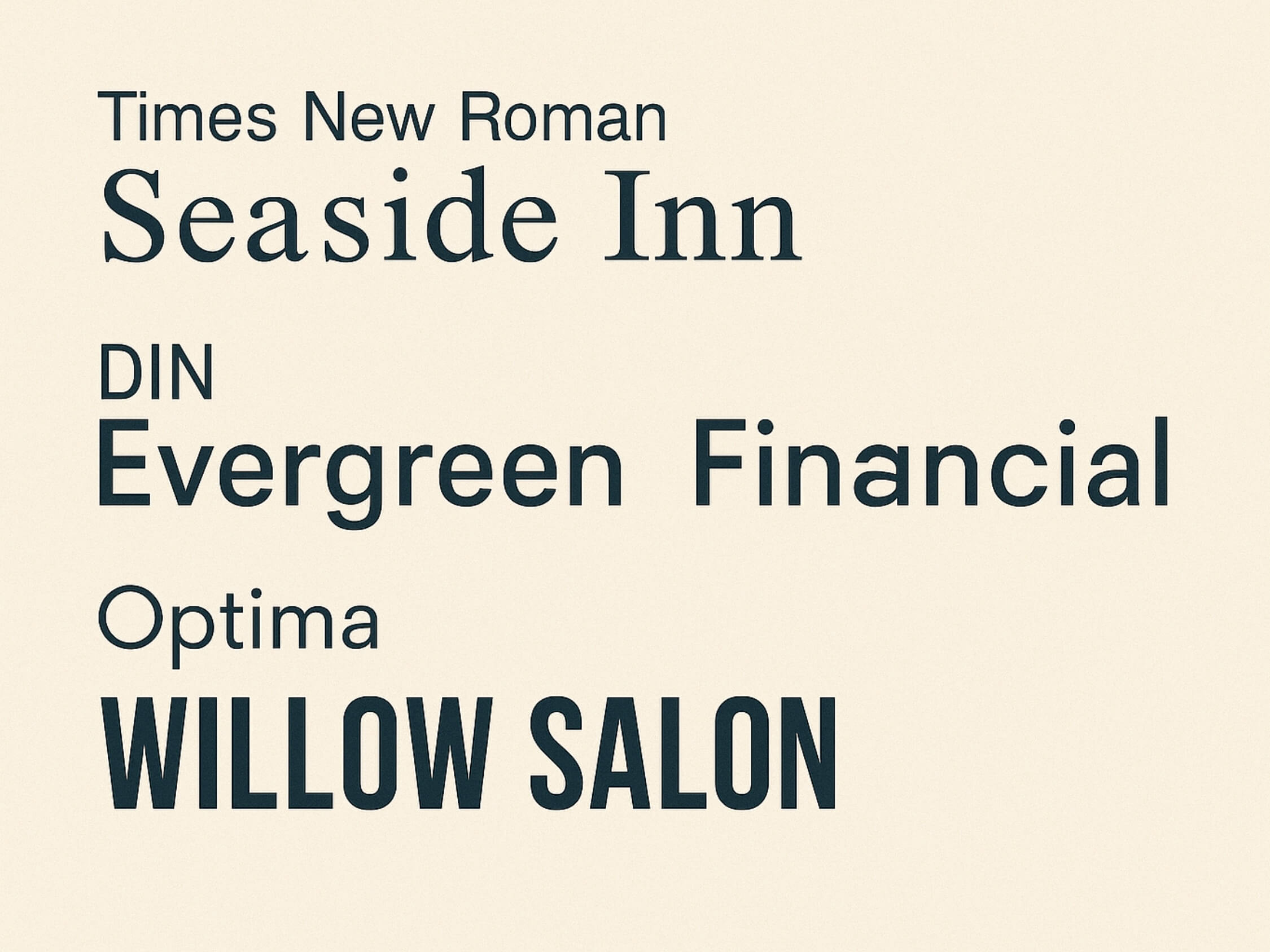
While we are flexible with font choices, we have identified a selection of fonts that are optimal for most sign designs. These fonts are clear, clean, and provide the legibility needed for both large and small-format prints.
Helvetica
Without any doubt, we can claim that ‘Helvetica’ is the most triggered font that is used in the banner advertisement due to its higher legibility.
Arial
An egress sign, or some other type of fire evacuation plan sign, should also be created and on display. It is ideal if the sign is fireproof.
Aboreto
It’s the most usual font used in the poster of movies and other graphic content of religious debate or any stuff related to the serious activity.
Arial Black
As one of the most common fonts to use on a banner and posters, this font is great because it’s plain and offer much readability for viewers. However, if you are willing to adjust a lot of words or letters in a smaller banner then this font is not appropriate.
Default
This font offers black lettering, for this, you can make your banner more compact to squeeze information on it.
Times New Roman
When you are willing to add brief or short phrases on the banner then this font will work for you to enhance legibility.
Cambo
It’s the most usual font used in the poster of movies and other graphic content of religious debate or any stuff related to the serious activity.
Cancun
As this font is much preferred for making headings, on top of that it's only available in uppercase so can be used for dragging attention.
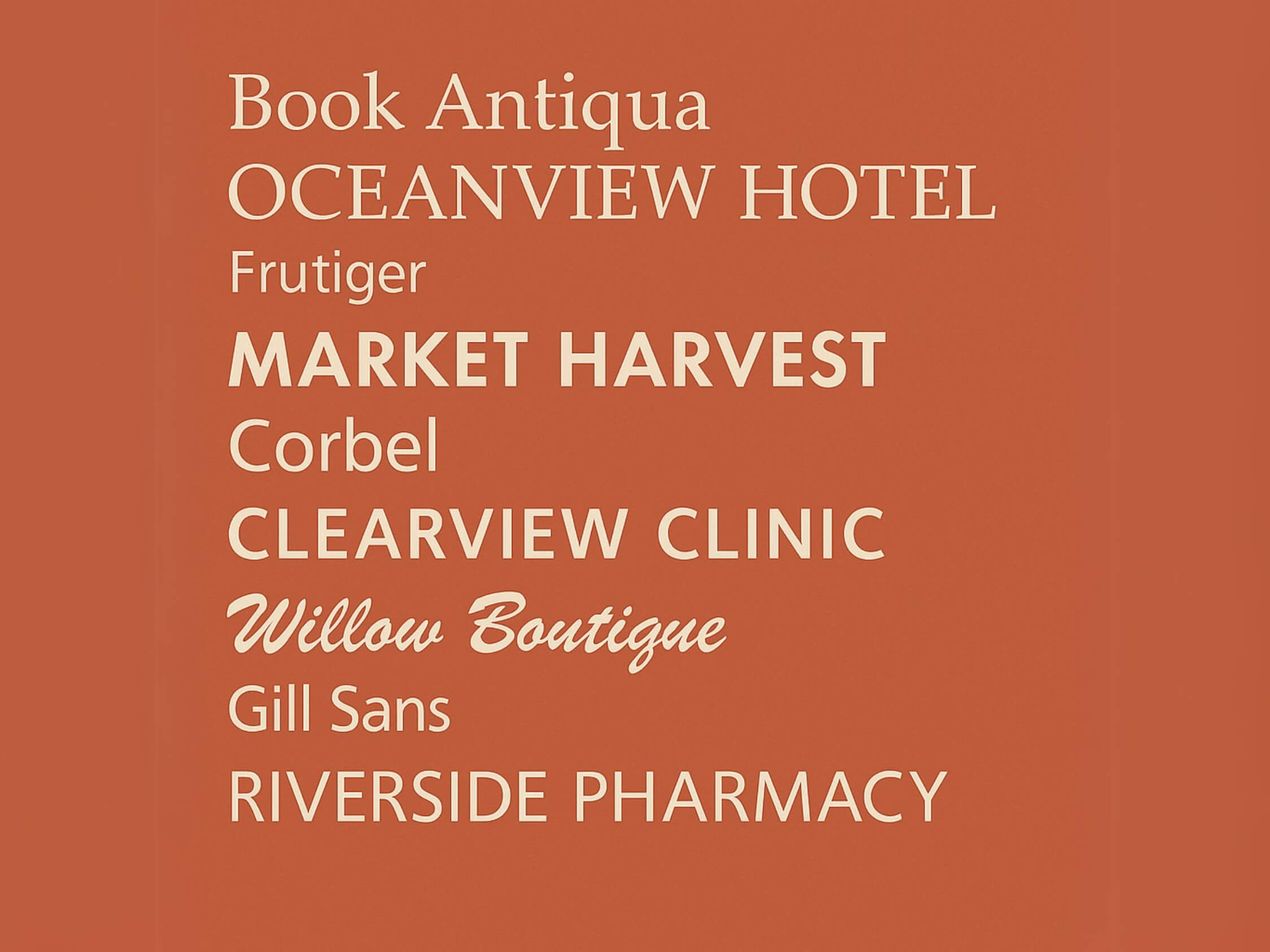
What are the Standard Font Styles We Offer?
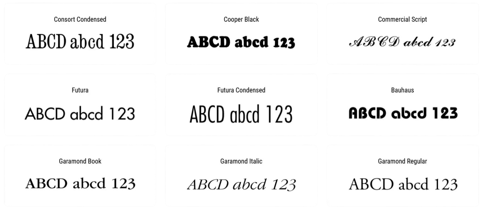
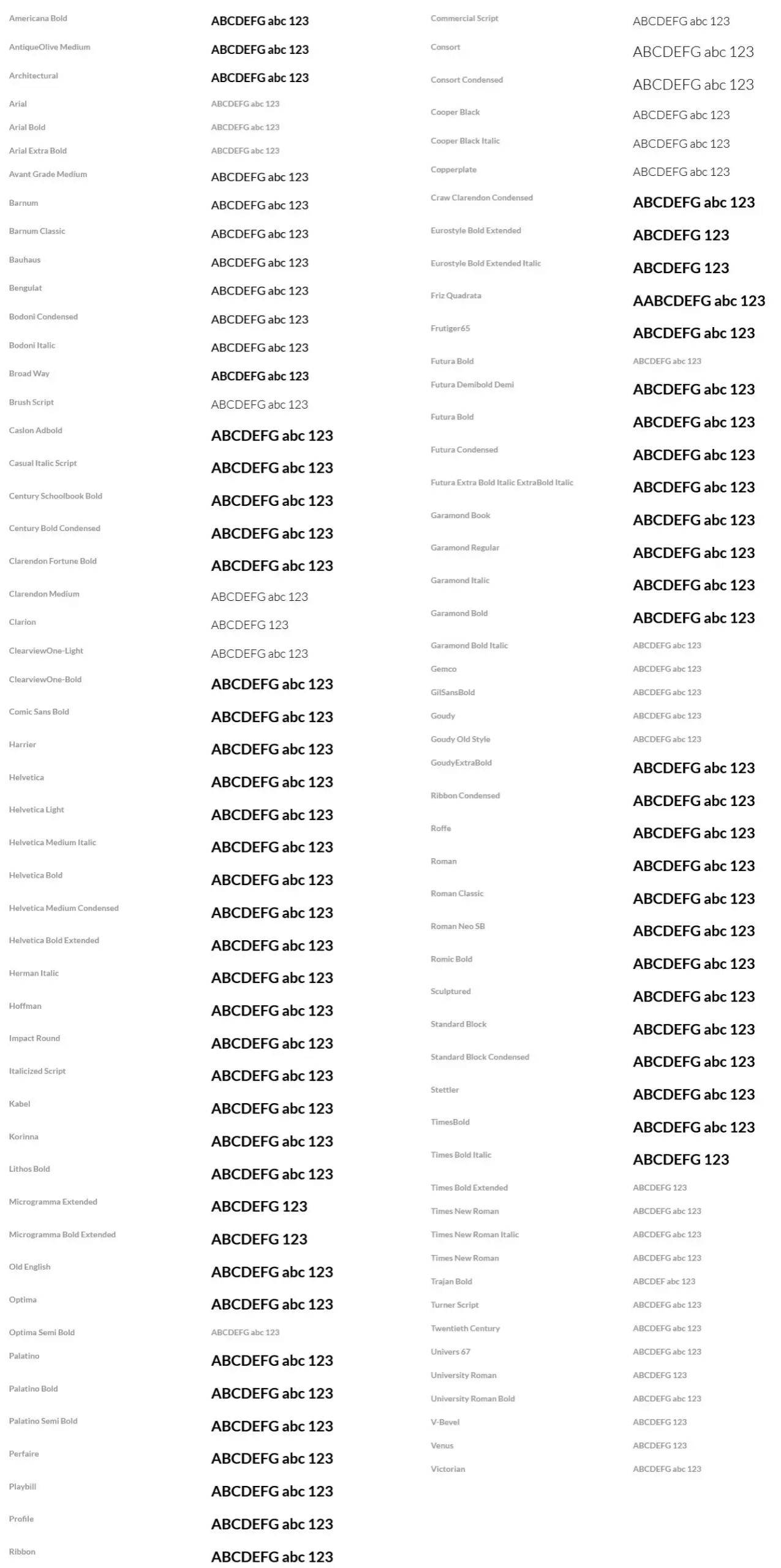
Font Guidelines
To maintain visual consistency and achieve the best print results, we recommend adhering to these font setup guidelines:
Text Hierarchy
Avoid Excessive Fonts
Avoid Overcomplicated Fonts
Keep It Simple
How to Submit Fonts for Your Design
When submitting your artwork, ensure that the fonts are included in your files in one of the following ways:
Embed Fonts
This is the most reliable way to ensure that your design remains consistent across different devices.
Outline Fonts
Converting text to outlines eliminates font compatibility issues and ensures your text remains the same, even if the font is not installed on our system.
Provide Font Files
If you use a custom font, include the font file(s) with your submission to ensure we can correctly reproduce the text.
Font Issues to Avoid
Poor font handling can lead to unexpected changes in your final sign. At Signs NYC, we want your design to print exactly as intended. Watch out for these common font-related issues when submitting your artwork:
-
Missing Fonts:
If we can’t access the font files or the font is not embedded, we may need to substitute it, which can alter your design. -
Incorrect Font Size:
Make sure text is large enough for visibility, especially if your sign is meant for viewing from a distance. -
Overuse of Effects:
Avoid using too many special text effects like shadows, outlines, or gradients, as these can hinder readability and affect print quality.
About Signs NYC
Based in New York City, Signs NYC is a trusted provider of custom signage and large-format printing. We deliver high-quality signs that balance visual impact with functionality—essential in NYC’s fast-moving environment.
Typography plays a key role in that impact. That’s why we offer a selection of standard fonts that ensure clarity, consistency, and professional results across all sign types.
Need Help with Fonts?
If you’re unsure about which fonts to choose or how to prepare your files, don’t hesitate to contact us. Our team can guide you in selecting the best typography for your signage and ensure it’s properly formatted for print.