ADA-compliant signage is not optional. Under the Americans with Disabilities Act, any business open to the public — and any facility that employs people — must provide accessible signage that communicates room identification, hazard warnings, and directional information in formats usable by people with visual, hearing, and cognitive disabilities.
This guide covers the ADA signage requirements most relevant to NYC businesses and building owners, the types of signs you need, and the story behind New York’s landmark update to the international accessibility symbol.
ADA Signage Requirements
What the ADA Requires for Business Signage
The ADA Standards for Accessible Design establish specific requirements for signs that identify permanent rooms and spaces. Key requirements include:
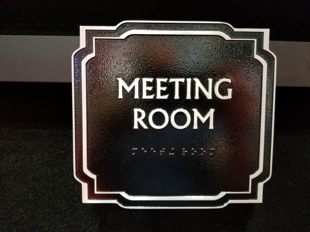
- Raised characters: Room identification signs must have raised (tactile) text that can be read by touch.
- Braille: Grade 2 contracted Braille must accompany the raised text on room identification signs.
- Non-glare finish: Sign surfaces must be matte or other non-glare materials to avoid visual interference.
- Color contrast: Text must contrast with its background at a ratio of at least 70%.
- Mounting height: The centerline of the Braille and raised text must be mounted between 48 and 60 inches from the finished floor, on the latch side of the door.
- Character proportions: Character height must be between 5/8 inch and 2 inches for raised characters.
Many NYC buildings were constructed before ADA requirements took effect. If you have received an accessibility complaint or DOB violation, Signs NYC can conduct a signage audit and produce compliant replacement signs on a fast turnaround.
Which Signs Are Required to Be ADA-Compliant?
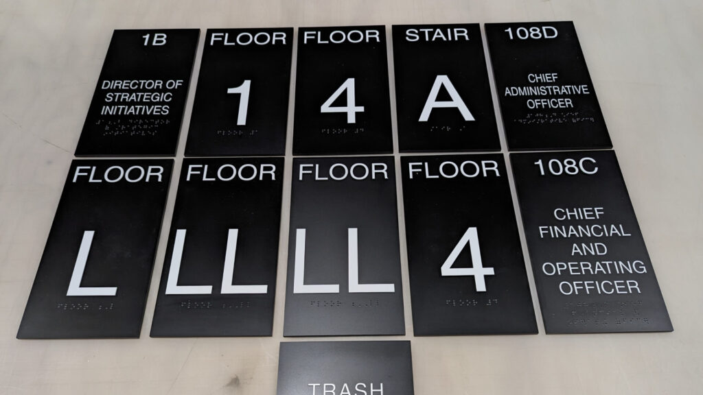
Not every sign in your facility needs to meet ADA standards — only those that permanently identify a room, space, or area.
| Sign Type | Where Required | ADA Features Required |
|---|---|---|
| Room ID Signs | All permanently named rooms (offices, conference rooms, restrooms) | Raised text, Grade 2 Braille, non-glare finish, high contrast, proper mounting height |
| Restroom Signs | All public and employee restrooms | ISA accessibility symbol, gender pictograms if applicable, tactile text |
| Exit Signs | All required exit doors | Illuminated signs meeting IBC and NFPA life safety requirements |
| Directional Signs | Accessible routes, entrances, and restrooms | High contrast and pictograms; tactile text usually not required |
| Hazard / Warning Signs | Stairs, mechanical rooms, hazardous areas | High contrast and clear visual warnings |
| Elevator Floor Signs | Inside elevator cab and at each landing | Raised floor numbers and Grade 2 Braille |
The NYC Handicap Symbol Update
How New York Updated the International Symbol of Access
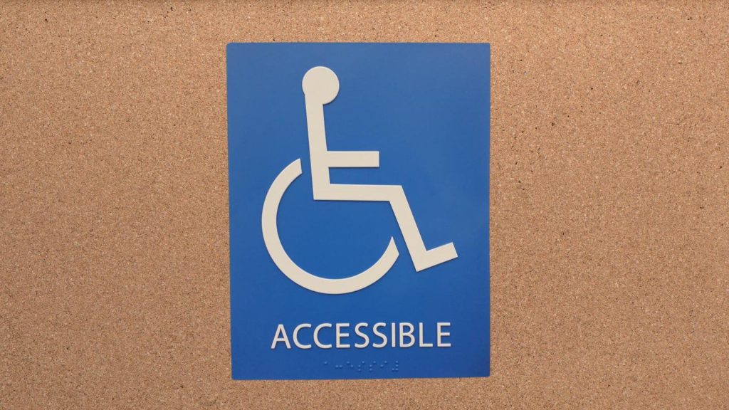
The familiar wheelchair symbol — a person seated in a stationary wheelchair with arms at the sides — was designed in 1968 as part of a Scandinavian design competition. For decades it served as the universal symbol for handicap access worldwide.
However, disability advocates argued that the symbol portrayed wheelchair users as passive and static. Advocacy groups began promoting a new version that better represented independence and motion.
What Changed in 2014
In 2014, New York State officially adopted the redesigned “active” accessibility symbol. The updated icon introduced several visual changes:
- Head position: The figure leans slightly forward, suggesting motion.
- Arms: The arms extend forward toward the wheel, indicating active movement.
- Leg placement: The legs are visually separated from the wheelchair to emphasize the individual rather than the device.
The new symbol complies with the same ISO accessibility pictogram standards as the original while presenting a more dynamic representation of people with disabilities.
The updated accessibility symbol is now required on all new handicap signage installed in New York State. If your building still uses the older static icon, it should be updated to remain compliant.
Reception and Ongoing Debate
The updated symbol has been widely praised by disability advocacy organizations as a meaningful shift in how accessibility is represented in public spaces. Some critics have argued the change may create inconsistency with the traditional symbol used in most other regions.
As of today, New York remains the only U.S. state to legally mandate the updated symbol, though many institutions nationwide have voluntarily adopted it.
Materials and Design for ADA Signs
ADA-compliant signs must be fabricated using materials that allow precise raised characters and Braille dots while maintaining high durability and non-glare finishes.
Photopolymer Signs
Photopolymer is the most widely used material for ADA signage. A UV-sensitive polymer sheet is exposed through a film negative to create raised characters and Braille dots.
This method produces highly accurate tactile lettering and allows hundreds of color combinations. Photopolymer signs are durable, lightweight, and ideal for offices, retail environments, and commercial buildings.
Cast Metal Signs
Cast aluminum or bronze ADA signs provide a premium appearance for corporate offices, law firms, banks, and historic buildings. Characters can be cast directly into the metal or machined afterward.
These signs are extremely durable and often chosen when aesthetics and longevity are priorities.
Acrylic with Applied Raster
Acrylic ADA signs use a clear or colored acrylic base with a photopolymer face layer that forms the raised characters and Braille.
This design allows the substrate color to show through, producing a sleek, contemporary look frequently used in modern office interiors.
Getting Your Building Into ADA Compliance
Failure to meet ADA signage requirements can result in civil lawsuits, Department of Justice complaints, and expensive legal settlements. Ensuring your building is compliant protects both your business and your visitors.
Signs NYC provides a complete ADA signage solution for businesses and building owners.
- ADA Signage Audit: We evaluate your current signage and identify compliance gaps.
- Custom Fabrication: All ADA signs are produced in-house with precise tactile lettering and Grade 2 Braille.
- Professional Installation: Signs are mounted at the exact ADA-required height and location.
- Rush and Same-Day Service: Fast turnaround for construction punch lists or compliance deadlines.
- DOB Violation Assistance: We can quickly replace non-compliant signs after an inspection notice.
Related Signage Guides
Learn more about other types of commercial signage used in offices and buildings:
- Office Signs Complete Guide
- Wayfinding Signs Guide
- HPD Building Signs
Ensure Your Building Is ADA Compliant
Signs NYC fabricates and installs ADA-compliant signs for offices, retail stores, healthcare facilities, and residential buildings across New York City and the Tri-State Area.
Signs NYC installs ADA-compliant signs across Manhattan, Brooklyn, Queens, The Bronx, Staten Island, and across New Jersey including Jersey City and Newark.

3 thoughts on “ADA Signs in NYC: Requirements, Types & the Evolution of Handicap Symbols”
ADA compliance is non-negotiable and this guide lays out the requirements clearly. We make a lot of ADA signage for offices and public buildings in Brooklyn. The evolution of the handicap symbol section is really interesting — the new dynamic symbol is a big improvement in representation.
The ADA requirements for signage are more specific than most people realize — tactile characters, braille, contrast ratios, mounting heights. This guide is a solid reference. The part about NYC’s updated handicap symbol was new information for me. Great overview.
ADA signage is one of those areas where getting it wrong can result in serious legal consequences. We’ve been making compliant signs for over two decades and the standards have only gotten more detailed. This article is a must-read for any building owner or facilities manager.