
Letters that are too small disappear into the block. Letters that are too large crowd the sign band, look cheap, and can exceed what zoning allows. Getting the size right is mostly a matter of answering four questions in order: how far away are your customers, how wide is your storefront, what does the city allow, and what can physically be built. This guide takes them one at a time for channel letters.
Start With Viewing Distance
The working rule in the sign trade is that one inch of letter height is readable from about ten feet away. A second, shorter distance matters too: the range at which the sign has its strongest impact, which is roughly a third of the readable distance.
| Letter height | Readable up to | Maximum impact distance |
|---|---|---|
| 6 inches | 60 feet | 20 feet |
| 8 inches | 80 feet | 26 feet |
| 10 inches | 100 feet | 33 feet |
| 12 inches | 120 feet | 40 feet |
| 18 inches | 180 feet | 60 feet |
| 24 inches | 240 feet | 80 feet |
| 36 inches | 360 feet | 100 feet |
These are estimates. Font, color contrast, lighting, and surroundings all change real-world legibility. The full chart is on our distance visibility page.
Applying It to a New York Street
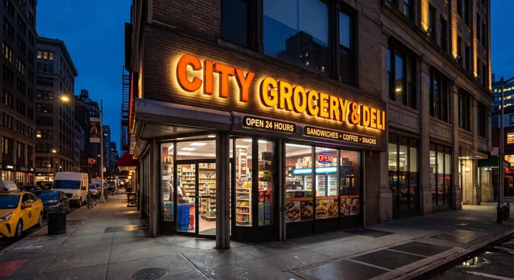
- A narrow side street, read from the opposite sidewalk: viewers are roughly 40 to 60 feet away. Letters of 10 to 14 inches read clearly.
- A wide avenue, read from across the street and from passing cars and buses: viewers are 100 feet away or more, and drivers have only a second or two. Letters of 18 to 24 inches are the usual range.
- A sign on an upper floor or a large building façade: distances are longer and letters of 24 inches and up are common.
This lines up with what we build most. Standard channel letter heights fall between 18 and 24 inches, and Signs NYC fabricates from 4 inches up to 48 inches.

Then Fit the Storefront
Viewing distance gives you a minimum. The storefront gives you a maximum.
- Width. A common rule of thumb is to let the lettering occupy about two thirds to three quarters of the available width, leaving clear space at both ends. Lettering that runs edge to edge looks cramped and is harder to read.
- Sign band height. Most storefronts have a horizontal band above the windows where the sign goes. Letters should leave breathing room above and below, so a 30 inch band suits letters of roughly 18 to 22 inches, not 30.
- Length of the name. A long name on a narrow storefront forces smaller letters. Options include stacking the name on two lines, abbreviating, or using a logo mark with a shorter wordmark.
Check What the City Allows
In New York the legal limit often decides the question before design does.
- In C1 and C2 districts, which include most neighborhood retail streets, illuminated signs may total three times the street frontage in square feet, up to a cap of 50 square feet.
- In C4, most C6, and C7 districts, the allowance is five times the frontage, up to 500 square feet.
- Signs may rise no more than 25 feet above the curb in C1 and C2 districts and 40 feet in the larger commercial districts.
- On landmarked storefronts, the Landmarks rule for halo-lit letters at the transom limits letter height to 18 inches.
A quick sense of scale: a ten-letter name in 18 inch letters runs roughly 12 to 13 feet long, which is in the neighborhood of 19 square feet when measured as a rectangle around the lettering. That fits within a 50 square foot allowance with room for a logo. The same name in 30 inch letters would run over 20 feet and would use most or all of the allowance on its own.
How the sign’s area is measured on the permit drawing matters, so have the sign company confirm it. Full details are in channel letter permits in NYC.
Your landlord may also set limits. Shopping centers and multi-tenant buildings often specify a minimum and maximum letter height in the lease.
What Can Be Built
Channel letters are hollow and lit from inside, which sets some physical limits.
- Stroke width. The stroke is the thickness of the lines that make up a letter. LED modules have to fit inside it, so very thin strokes cannot be evenly lit. Fine script and light-weight fonts often need to be thickened or built larger.
- Small letters. Below roughly 8 to 10 inches, many fonts do not leave enough room for conventional construction. Taglines and secondary text at small sizes are commonly made as non-illuminated dimensional letters or put in a small cabinet instead.
- Depth. Five inches is the standard depth, and depths from 2 to 12 inches are available. Larger letters generally need more depth so the light spreads evenly across the face.
The parts involved are explained in anatomy of a channel letter.
Upper and Lower Case
Letter height is normally quoted by the capital letter. In a name set in upper and lower case, the lower-case letters are noticeably shorter, so the sign reads smaller than an all-capitals sign of the same quoted height. If your name is in mixed case, size it by how the lower-case letters read at distance, and remember that descenders such as g, p, and y need space below the baseline.
Size and Cost
Larger letters cost more, and the increase is steeper than the height alone suggests, because material and LED count grow with the letter’s area. There is no benefit in paying for 30 inch letters on a street where 18 inches reads comfortably. See how much channel letters cost in NYC.
A Five-Step Sizing Method
- Stand where your customers will first see the sign and estimate the distance.
- Divide that distance in feet by ten for the minimum letter height in inches, then go up a size for traffic or a busy visual background.
- Measure the storefront width and sign band height, and see what fits with clear space around it.
- Check the zoning district’s sign area cap, any landmark limits, and the lease.
- Ask for a scaled mock-up on a photo of your storefront before approving the design.
Frequently Asked Questions
What is the most common channel letter size? For street-level storefronts, 18 to 24 inches.
How small can channel letters be? Signs NYC builds from 4 inches, but the font has to be bold enough at that size to hold lighting. For small text, non-illuminated letters are often the better choice.
Do bigger letters always mean better visibility? No. Past the size the viewing distance calls for, extra height adds cost and crowding without adding legibility. Contrast and lighting quality matter as much as size.
Does the logo count toward the sign area? Yes. Everything that makes up the sign counts toward the zoning allowance.
Get a Scaled Mock-Up
Signs NYC will survey your storefront, check the limits that apply to your address, and show you your name at two or three sizes on a photo of the building. Request a quote or call 718-453-8300.
